
Math Articles, tips & study guides
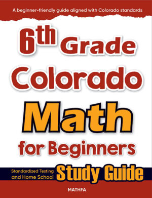 6th Grade Colorado Math for Beginners Original price was: $21.99.$14.99Current price is: $14.99.Download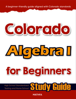
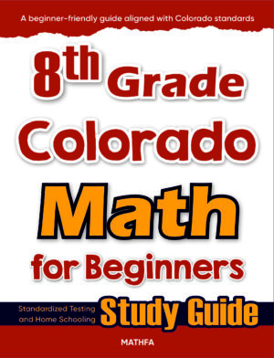 8th Grade Colorado Math for Beginners Original price was: $21.99.$14.99Current price is: $14.99.Download
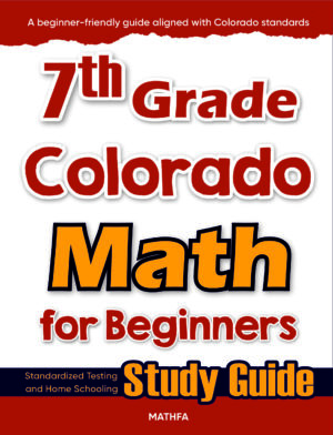 7th Grade Colorado Math for Beginners Original price was: $21.99.$14.99Current price is: $14.99.Download
 CMAS Grade 8 Math Workbook: Review for the Colorado Measure of Academic Success With 2 Full-Length CMAS Math Exams Original price was: $18.99.$12.99Current price is: $12.99.Download
 STAAR Grade 3 Summer Math Workbook: Essential Summer Learning Math Skills plus Two Complete STAAR Math Practice Tests Original price was: $18.99.$12.99Current price is: $12.99.Download
 ALEKS Math Comprehensive Exercise Book: Abundant Math Skill Building Exercises Original price was: $18.99.$12.99Current price is: $12.99.Download
 STAAR Grade 7 Summer Math Workbook: Essential Summer Learning Math Skills plus Two Complete STAAR Math Practice Tests Original price was: $18.99.$12.99Current price is: $12.99.Download
 How to Use CMAS Practice Tests to Boost Your Child Math Score
 NSCAS Sequences & Series Practice — Nebraska Guide
 How to Pass the RISE Math Test in Utah
 WFE Rounding and Estimation Practice — Wisconsin Guide
 7 AK STAR Middle School Prep Tips (Alaska)
CMAS Scatter Plots Practice — Colorado Guide


📖 Reading time: 11 min
Quick answer: To succeed with CMAS scatter plots practice, students should learn to identify correlation direction, draw trend lines by eye, interpret slope in context, and eliminate answer choices that contradict the data — four skills that appear consistently across Colorado math assessments in grades 5 through 8.
Who this is for: Colorado students in grades 4 through 12 preparing for the CMAS math assessment, parents supporting their child’s math review at home, and classroom teachers looking for targeted scatter plot instruction and practice strategies.
Here’s a fact that surprises many Colorado families: data analysis questions — including scatter plots — make up a significant portion of the CMAS math assessment, yet most students spend the least amount of time practicing them. That imbalance costs points on test day. According to the Colorado – CMAS Math Assessment, the test is built around the Colorado Academic Standards, which place a strong emphasis on data, statistics, and mathematical reasoning beginning in the upper elementary grades.
Scatter plots feel unfamiliar to many students because they don’t look like a typical algebra problem. There are no neat equations to solve and no single correct numerical answer to calculate. Instead, you’re asked to read a graph, reason about patterns, and communicate what the data is telling you. That combination of visual reading and logical reasoning trips up even students who are strong in arithmetic and algebra.
This guide walks you through everything you need to master Colorado CMAS scatter plots practice — from understanding what scatter plots actually measure, to the most common mistakes students make, to memory tricks, worked examples, and strategies parents and teachers can use to build lasting math confidence. By the end, you’ll have a clear, step-by-step plan for turning scatter plots from a weak spot into a reliable source of points on test day.
Why Scatter Plots Matter for Colorado Math Standards
What Scatter Plots Actually Measure
Scatter plots are one of the most powerful tools in data analysis because they show the relationship between two numerical variables at the same time. Mastering scatter plots builds the kind of mathematical reasoning that Colorado Academic Standards describe as essential: the ability to look at real-world data, identify patterns, and draw evidence-based conclusions. That’s not just a test skill — it’s a life skill.
When a student reads a scatter plot correctly, they’re practicing several math skills simultaneously. They’re reading a coordinate plane, which reinforces their understanding of ordered pairs and the x- and y-axis. They’re analyzing trends, which connects to proportional reasoning and rate of change. And they’re making predictions from data, which is the foundation of statistical thinking used in science, economics, and everyday decision-making. Few other single topics in middle school math require students to draw on this many connected skills at once.
Colorado’s math standards — aligned with the Common Core State Standards for Statistics and Probability — expect students to construct and interpret scatter plots as early as grade 8. The standards specifically ask students to describe patterns of association such as positive or negative correlation, linear or nonlinear clustering, and outliers. Students who understand these concepts don’t just answer scatter plot questions correctly — they also perform better on related questions about functions, proportional relationships, and data analysis throughout the test.
The practical stakes are real. The CMAS (Colorado Measures of Academic Success) assessment is administered to students in grades 3 through 8 and again in high school, and data analysis questions appear across multiple grade levels. Doing well on this section requires more than memorizing definitions — it requires fluid, flexible thinking about what data looks like and what it means.
How Scatter Plots Connect to Broader Math Mastery
One of the most underappreciated benefits of studying scatter plots is how naturally the concept connects to algebra. The line of best fit — the trend line drawn through a scatter plot — is a linear equation. Its slope represents a rate of change, and its y-intercept has a real-world meaning within the context of the data. When a student can read that connection fluently, they’re reinforcing slope-intercept form, interpreting functions, and building quantitative reasoning all at once.
Students who work through scatter plot problems regularly also develop stronger number sense, because the activity forces them to ask whether a data value is reasonable. If a scatter plot shows a positive relationship between hours of study and test scores, a student who predicts a score of 200 out of 100 for 10 hours of study has made an arithmetic error — and the graph makes that error visible immediately. That kind of self-checking is exactly the habit that strong math students develop over time.
Beyond algebra, scatter plots appear in science classes, social studies projects, and health data literacy discussions. A student who is comfortable reading and interpreting scatter plots has an advantage across subjects, not just on math test day. Building this skill early pays dividends for years.
Common Mistakes Students Make with Colorado CMAS Scatter Plots
The Most Costly Errors on the Test
The most common scatter plot mistake is confusing correlation with causation — and the CMAS frequently tests whether students understand this distinction. Correlation simply means two variables tend to move together. Causation means one variable directly causes the other to change. These are not the same thing, and no scatter plot alone can prove causation.
Here’s a classic example of how this plays out on a test question: a scatter plot shows a strong positive correlation between shoe size and reading level in elementary school students. A student who confuses correlation with causation might conclude that bigger feet cause better reading. The real explanation, of course, is that both variables increase with age — it’s a third variable driving both. CMAS questions in grades 7 and 8 regularly probe this exact type of reasoning, and students who haven’t practiced it carefully will choose the wrong answer every time.
A second frequent error is misreading the direction of the trend line. Students sometimes see a cluster of dots that slopes slightly downward but still call it a positive correlation because most of the individual data points are in the upper half of the graph. Direction of correlation is determined by the overall trend of the data — specifically, whether y-values tend to increase or decrease as x-values increase — not by where the dots are located vertically. Practicing with multiple scatter plots that have subtle directional changes helps students build the visual habit of reading left-to-right across the graph before drawing any conclusion.
A third mistake involves outliers. Many students ignore outliers entirely, or they let a single extreme point dominate their interpretation of the whole dataset. On CMAS, outlier questions often ask students to identify which point doesn’t fit the pattern, or to explain how removing the outlier would change the trend line. If a student hasn’t thought carefully about what an outlier is — a data point that falls well outside the general cluster — they’ll struggle to answer these questions accurately.
Mistakes When Drawing the Line of Best Fit
Drawing the line of best fit by hand is a skill many students underestimate. The most common error is drawing a line that connects the first and last data points, rather than balancing the line so roughly equal numbers of points fall above and below it. A well-drawn line of best fit doesn’t have to pass through any actual data point — it passes through the center of the cloud of points, minimizing the overall distance between the line and every point.
Another frequent line-of-best-fit error is forcing the line through the origin. Students sometimes assume every line must start at (0, 0), especially when they’ve spent a lot of time on proportional relationships where that’s true. In scatter plots, the line of best fit starts wherever the data pattern begins — and the y-intercept is often a meaningful value. For example, in a scatter plot of monthly advertising spend versus monthly sales, the y-intercept might represent baseline sales that occur even with zero advertising. Zeroing that out would misrepresent the data.
Students who build their scatter plot skills on a strong algebra foundation avoid many of these errors automatically. For students who want structured practice that reinforces both the algebra underpinning scatter plots and the data interpretation skills the CMAS requires, Colorado Algebra 1 for Beginners provides step-by-step coverage of linear relationships and data analysis concepts in a format designed specifically for Colorado learners — making it a natural companion to CMAS scatter plot review.
As the U.S. Department of Education has noted, students who receive structured, standards-aligned instruction in data literacy show measurably better outcomes on state assessments. Targeted practice with real scatter plot problems — not just passive reading — is what drives that improvement.
📚 More from Math Notion
Step-by-Step CMAS Math Scatter Plots Tips for Test Day
Approaching every scatter plot question with the same consistent process is the fastest way to reduce errors and build speed. These seven steps work for every scatter plot question format on the CMAS — whether it’s multiple choice, short answer, or extended response.
- Read the axis labels before looking at the dots. Every scatter plot has two axes, each representing a real-world variable with units. Before you look at any data point, read the x-axis label, the y-axis label, and the scale on each axis carefully. Students who skip this step regularly misinterpret the context of the data and choose answers that are mathematically correct but contextually wrong. For example, if the x-axis is labeled “weeks” and the y-axis is “weight in pounds,” a slope of 2 means 2 pounds per week — not 2 pounds total.
- Identify the direction of the relationship immediately. Scan the cloud of data points from left to right. If the dots trend upward as you move right, the correlation is positive. If they trend downward, it’s negative. If there’s no clear upward or downward pattern, the correlation is approximately zero, or nonexistent. This single observation answers a large proportion of CMAS scatter plot questions on its own, so building this habit is worth the thirty seconds it takes.
- Estimate the strength of the correlation. A strong correlation means the dots cluster tightly around an imaginary line. A weak correlation means the dots are spread loosely. You don’t need an exact number — just note whether the relationship is strong, moderate, or weak. This distinction often appears in answer choices, and students who haven’t practiced estimating correlation strength will guess between “strong positive” and “moderate positive” without a clear reason.
- Locate any outliers and note their position. An outlier is a point that sits far away from the main cluster of data. On the CMAS, outlier questions typically ask you to identify which point is the outlier, explain why it doesn’t fit the pattern, or predict what the trend line would look like without it. Train yourself to locate outliers as part of your initial scan — before reading the question — so you already know where they are when the question asks.
- Draw or visualize the line of best fit. Even when the test doesn’t explicitly ask you to draw the line, visualizing it helps you answer questions about predictions and trends. Imagine a straight line that splits the cloud of dots roughly in half, with similar numbers of points above and below. Then use that mental line to make predictions: if the question asks what y-value corresponds to a given x-value, trace from the x-axis up to your imaginary line, then left to the y-axis.
- Use the line of best fit for predictions — and stay within a reasonable range. Interpolation means predicting a value within the range of your data — this is reliable. Extrapolation means predicting outside your data range — this is less reliable, and the CMAS sometimes asks you to recognize when a prediction would require extrapolation. If the data covers x-values from 0 to 50 and a question asks you to predict the y-value at x = 200, recognize that you’re extrapolating, and flag that prediction as uncertain.
- Eliminate answer choices that contradict the direction or strength you identified. After completing steps 1 through 6, use your observations to eliminate wrong answers systematically. If the data shows a weak negative correlation, eliminate any choice that says “strong positive.” Process of elimination is one of the most reliable math test strategies available, and it works especially well on scatter plot multiple-choice questions because wrong answers are usually wrong in identifiable ways.
Practicing these steps on CMAS math scatter plots tips requires repetition with real data. Free math worksheets that include scatter plot problems are available through your school’s math department or through Colorado’s instructional resources portal — but the key is to practice the full seven-step process every time, not just to check whether you got the right answer. The process builds the habit; the habit builds the score.
It also helps to work through step-by-step math problems in a structured workbook before attempting timed test simulations. Building the habit of systematic reasoning on untimed practice makes the process feel automatic when the clock is running on test day.
Worked Examples: Reading and Interpreting Scatter Plots
Example 1: Identifying Correlation and Making a Prediction
Problem: A scatter plot shows the number of hours eight students studied for a math test (x-axis, ranging from 1 to 9 hours) and their test scores (y-axis, ranging from 55 to 98). The data points are: (1, 58), (2, 63), (3, 70), (4, 72), (5, 78), (6, 85), (7, 89), (9, 95). A student asks: “What score would you predict for a student who studied 8 hours?”
Step 1: Read the axis labels. The x-axis is “hours studied” and the y-axis is “test score.” Both are clearly defined with reasonable scales.
Step 2: Identify the direction. As hours studied increase (moving left to right), test scores increase. This is a positive correlation.
Step 3: Estimate strength. The points cluster closely around an upward-sloping line with no dramatic gaps or scatter. This is a strong positive correlation.
Step 4: Check for outliers. All eight points follow the upward trend without any data point sitting far from the cluster. No significant outliers.
Step 5: Draw the line of best fit. Visualize a line passing through approximately (1, 57) and (9, 95). The slope of this line is roughly (95 − 57) ÷ (9 − 1) = 38 ÷ 8 ≈ 4.75 points per hour.
Step 6: Make the prediction. At x = 8 hours: start at x = 7 with a score of approximately 89, then add roughly 4.75 for one more hour. Predicted score ≈ 92 to 94. This is interpolation — 8 hours falls within our data range — so the prediction is reliable.
Answer: A student who studied 8 hours would be predicted to score approximately 92–93 on the test. This is consistent with the strong positive linear relationship shown in the data.
Example 2: Identifying an Outlier and Explaining Its Effect
Problem: A scatter plot shows the relationship between daily temperature (x-axis, in °F) and hot chocolate sales at a school café (y-axis, in cups sold). Most data points follow a clear negative correlation — as temperature rises, hot chocolate sales fall. However, one point at (72°F, 95 cups) sits far above the rest of the data. The question asks: “Is the point at (72, 95) an outlier? How would removing it affect the line of best fit?”
Step 1: Confirm the overall trend. The majority of data shows a negative correlation: higher temperatures lead to fewer hot chocolate sales. That’s the expected pattern.
Step 2: Evaluate the suspicious point. At 72°F, the data predicts very low hot chocolate sales based on the trend. Instead, this point shows 95 cups sold — far above what the trend line would predict. Yes, (72, 95) is an outlier.
Step 3: Explain the real-world reason. Perhaps the school hosted a special event that day, or a teacher required students to purchase a hot beverage for a class activity. Outliers often have real-world explanations worth noting.
Step 4: Predict the effect of removing the outlier. The outlier pulls the line of best fit upward and slightly flattens its negative slope, because the best-fit algorithm tries to account for that high point. Removing it would make the line steeper in the negative direction and lower overall — better reflecting the true relationship between temperature and sales.
Answer: Yes, (72, 95) is an outlier. Removing it would make the line of best fit steeper (more strongly negative) and more accurately reflect the negative correlation between temperature and hot chocolate sales.
Example 3: Distinguishing Correlation from Causation
Problem: A scatter plot shows a strong positive correlation between the number of fire trucks dispatched to a fire (x-axis) and the amount of fire damage in dollars (y-axis). A student concludes: “More fire trucks cause more damage.” Is this conclusion valid?
Step 1: Identify the correlation. The data shows a strong positive correlation — as the number of fire trucks increases, so does the dollar amount of damage.
Step 2: Question the causal claim. Does sending more trucks cause more damage? Think about what’s really happening. Larger, more dangerous fires require more trucks — and also cause more damage. The size of the fire is the lurking variable driving both the number of trucks and the damage amount.
Step 3: Apply the correlation vs. causation rule. A scatter plot can only show that two variables move together — it cannot show that one causes the other. The student’s conclusion is invalid.
Answer: The conclusion is incorrect. Fire truck count and fire damage are both caused by the size and severity of the fire — a third variable. More trucks do not cause more damage; bigger fires require more trucks and produce more damage simultaneously. This is a classic example of correlation without causation.
🎯 Recommended Math Book
Colorado Algebra 1 for Beginners — $16.99
Category: Algebra 1, Colorado, General, Test
Comprehensive Algebra 1 Study Guide & Workbook
Perfect for classroom learning, homeschooling,
or extra practice at home.
Memory Tricks and Shortcuts for Scatter Plots
Quick Mental Anchors That Actually Work
Memory tricks work best when they connect a math concept to something visual or physical. For scatter plots, the most reliable tricks are tied to the shapes and directions students already recognize from everyday life.
To remember correlation direction, use the “hill or valley” rule. Positive correlation looks like you’re climbing a hill — the data rises from left to right, just like walking uphill. Negative correlation looks like you’re descending into a valley — the data falls from left to right, just like walking downhill. Zero correlation looks like flat terrain — no direction at all. Students who visualize this physical landscape the moment they see a scatter plot almost never confuse positive and negative correlation.
To remember correlation strength, use the “pencil test”. Imagine holding a pencil horizontally over the data. If the cloud of points is narrower than your pencil (tightly clustered), the correlation is strong. If the cloud is as wide as your hand (spread out), the correlation is weak. If the cloud is as wide as the whole graph with no discernible pattern, there’s no correlation. This mental image takes about two seconds to apply and immediately gives you a reliable strength estimate.
To remember the difference between interpolation and extrapolation, use the prefix trick. “Inter-” means “between” (like in the word “interstate highway” — a road between states). Interpolation is predicting between your data points — safe and reliable. “Extra-” means “outside” or “beyond” (like “extraordinary” — beyond ordinary). Extrapolation is predicting outside your data range — less reliable. Once students lock in those prefix meanings, they never confuse the two terms again.
For the line of best fit, teach students the “balance beam” image. The line of best fit is like a balance beam — it has to be positioned so the weight (data points) on both sides balances out. If more points are piled above the line than below it, the beam tips — the line needs to shift. This image prevents the common error of drawing a line that touches the most points rather than balancing above and below equally.
Finally, to lock in the correlation-vs.-causation distinction, use the “third wheel” reminder. Whenever two variables correlate, ask: “Is there a third wheel — a hidden variable — driving both of them?” In the fire truck example, the size of the fire is the third wheel. In the shoe size and reading level example, age is the third wheel. Teaching students to automatically look for the third wheel builds the habit of questioning causal claims — which is exactly what high-level CMAS math scatter plots questions test.
Scatter Plots on Standardized Tests Beyond CMAS
How This Skill Transfers Across Major US Math Assessments
Scatter plot mastery isn’t just a Colorado skill — it transfers directly to every major standardized math assessment students will face throughout their academic and professional lives. Understanding this gives students a powerful motivational reason to invest time in CMAS scatter plots practice now.
On the SAT Math section, scatter plots appear in the “Problem Solving and Data Analysis” domain, which makes up approximately 29% of all SAT math questions. College Board SAT practice tests consistently include 2–3 scatter plot questions, often combining line-of-best-fit interpretation with equation writing. A student who can fluently read scatter plots and extract the slope and y-intercept of the trend line can answer these questions faster and more accurately than peers who treat them as unfamiliar territory.
The ACT Math section includes data representation questions throughout, and the ACT Science section — which heavily tests data interpretation from graphs and scatter plots — rewards exactly the skills built through scatter plot practice. Students who’ve mastered scatter plots in preparation for the CMAS often find ACT science passages significantly less intimidating than classmates who haven’t.
The GED Mathematical Reasoning test includes questions on data analysis and statistical reasoning, including scatter plots and trend lines. According to the GED Testing Service, the Mathematical Reasoning section covers algebraic problem solving and quantitative reasoning — and scatter plot interpretation falls squarely in both categories. Adults returning to school who invest time in scatter plot skills find they can answer these questions confidently without re-learning entirely new material.
State standardized tests across the country — including STAAR in Texas, MCAS in Massachusetts, SBAC in California, and PARCC-aligned assessments in other states — all include scatter plot and data analysis questions aligned to Common Core Statistics and Probability standards. The CMAS scatter plot skills Colorado students develop transfer directly to any of these assessments, which matters for students who move between states or take online programs with nationally normed math assessments.
College placement tests such as the Accuplacer and ALEKS — used by community colleges and universities to determine math course placement — also test scatter plot interpretation in their statistics and data analysis modules. A student who places into a higher math course based on strong data literacy skills saves both time and tuition money. The math practice problems students work through for CMAS scatter plots are the same problems that build placement test readiness.
Practice Strategies for Parents and Teachers
How Adults Can Actively Support Scatter Plot Learning
Parents don’t need to be math experts to help their children succeed with scatter plots. The most effective support comes from building consistent practice habits, asking the right questions, and making data feel relevant to everyday life — not from re-teaching math concepts from scratch.
One of the most powerful things a parent can do is find scatter plots in the real world and talk about them together. Weather forecast apps often show temperature over time as a line graph that resembles a trend line. Sports statistics — batting averages by year, points scored per game as a function of practice hours — frequently appear as scatter plots in newspaper sports sections and online. When a student sees that scatter plots describe real, interesting data rather than invented textbook scenarios, their engagement with the concept changes immediately.
Parents can also support CMAS scatter plots practice by asking simple discussion questions during homework time. “Which direction does this go — up or down?” “How tightly clustered are the points?” “Does any point look like it doesn’t belong?” These questions reinforce the same analytical steps that students need on the test, and they require no math expertise to ask. The habit of talking through a graph before answering a question is enormously valuable — and it’s a habit that home conversations can build just as effectively as classroom instruction.
For teachers, the most effective classroom strategies for scatter plots involve frequent, brief practice rather than long infrequent sessions. Five scatter plot warm-up problems distributed across five school days builds stronger retention than twenty-five problems in a single ninety-minute session. Vary the contexts: one day use sports data, the next use science data, the next use economic data. Contextual variety forces students to apply their skills flexibly rather than pattern-matching to a specific format they’ve seen before.
Teachers should also explicitly teach the language of scatter plots — words like correlation, trend line, outlier, interpolation, and extrapolation — before working through interpretation problems. Students who don’t know the vocabulary struggle to parse the question, even when they understand the underlying math concept. Vocabulary instruction paired with visual anchor images (like the hill, valley, and pencil examples from the previous section) accelerates comprehension faster than vocabulary lists alone.
Using math homework help sessions — whether after school, during office hours, or in tutoring groups — to focus specifically on scatter plot interpretation is especially valuable in the weeks leading up to CMAS testing. Having students explain their reasoning aloud as they work through math practice problems is one of the most reliable ways to catch misconceptions before they solidify into test-day errors. If a student can explain why a correlation is positive and moderate, they understand it. If they can only identify it without explaining it, the understanding is fragile.
Building Math Confidence Alongside Content Knowledge
Many students who struggle with scatter plots aren’t missing math knowledge — they’re missing math confidence. They look at an unfamiliar graph, feel a wave of uncertainty, and shut down before they’ve even read the axis labels. That reaction is a form of math anxiety, and it’s worth addressing directly rather than hoping it resolves on its own.
Parents and teachers can help students overcome math anxiety around scatter plots by celebrating process over product. A student who correctly identifies the direction of correlation but makes a prediction error has demonstrated genuine understanding — that’s worth acknowledging. Framing practice as “let’s figure out what this graph is saying” rather than “let’s see if you get the right answer” takes the pressure off individual questions and focuses attention on the reasoning process, which is where real math mastery develops.
Consistent, low-stakes practice with free math worksheets, online tools, and workbooks builds the exposure that eventually makes scatter plots feel routine. The goal is for students to walk into the CMAS math section and think “I’ve seen this kind of graph a hundred times” — because at that point, they have.
When to Seek a Tutor or Extra Help
Recognizing the Signs That Independent Practice Isn’t Enough
Most students can make meaningful progress on scatter plot skills through consistent self-study and parent support. However, there are specific situations where seeking a math tutor or structured extra help is the clearest path to improvement — and recognizing those situations early prevents weeks of frustration.
The clearest signal that extra help is needed is persistent confusion about a foundational concept despite multiple explanations. If a student has read explanations of correlation direction three times, watched videos, and worked through practice problems — and still consistently confuses positive and negative correlation — there’s likely a gap in the underlying conceptual understanding that a tutor can identify and address directly. That kind of targeted diagnosis is difficult to achieve through self-study alone.
A second signal is score stagnation. If a student has been practicing scatter plot problems regularly for two or three weeks and their accuracy hasn’t improved, something in their practice approach isn’t working. A tutor can observe the student’s problem-solving process in real time and identify exactly where the reasoning breaks down — whether it’s at the graph-reading stage, the prediction stage, or the answer-elimination stage. Knowing where the error occurs is more valuable than knowing that an error occurred.
Significant math anxiety — the kind that causes a student to freeze, avoid math practice entirely, or experience physical symptoms of stress during math tests — also warrants professional support. A tutor who specializes in math confidence as well as content knowledge can use structured, encouraging practice to gradually rebuild a student’s relationship with data analysis. This isn’t a personality flaw to push through; it’s a learnable skill that responds well to patient, consistent instruction.
Parents should also consider extra support if their child consistently scores below proficiency on CMAS math practice assessments in the data analysis domain across multiple testing periods. The CMAS is designed to measure grade-level academic growth, and a pattern of below-proficiency scores in a specific domain — especially one as broadly applicable as data analysis — signals that the student needs more targeted support than the standard classroom curriculum provides.
When looking for a tutor, prioritize someone with experience teaching Colorado Academic Standards and familiarity with the CMAS format specifically. A tutor who knows the test structure, the question types, and the scoring expectations can target instruction far more efficiently than a general math tutor who teaches to abstract standards. Many local tutoring centers, school district programs, and online platforms now offer CMAS-specific math support — and most schools can connect families with district-provided resources at no cost.
Frequently Asked Questions
What types of scatter plot questions appear on the Colorado CMAS math test?
CMAS scatter plot questions typically ask students to identify correlation direction (positive, negative, or none), estimate correlation strength, draw or interpret a line of best fit, make predictions using the trend line, identify outliers, and distinguish between correlation and causation. In higher grades, questions may also ask students to write the equation of the line of best fit or explain the real-world meaning of the slope. Practicing all of these question types through Colorado CMAS scatter plots review prepares students for every format they’re likely to encounter.
How do I draw the line of best fit correctly on a CMAS math problem?
Draw the line of best fit so that roughly equal numbers of data points fall above and below the line, and the line follows the overall direction of the data cloud. The line doesn’t have to pass through any actual data point — it represents the average trend, not the individual points. Avoid the common error of drawing the line through the two extreme points or forcing it through the origin. A well-drawn line balances the data like a beam, with the weight distributed evenly on both sides.
How is CMAS scatter plots practice different from regular math homework help?
CMAS scatter plots practice is more targeted than general math homework help because it focuses specifically on the question formats, language, and reasoning skills tested on the Colorado Measures of Academic Success assessment. Regular homework often covers the same concepts in isolation, but CMAS practice combines graph reading, data interpretation, and elimination strategies within the time constraints and format of the real test. Students who practice specifically for the CMAS — rather than just completing textbook scatter plot exercises — develop the test fluency that translates directly to higher scores on test day.
Key Takeaways
- Scatter plots test multiple math skills simultaneously — coordinate plane reading, trend analysis, proportional reasoning, and statistical thinking — making them one of the highest-leverage topics to master for CMAS math success.
- The most common mistakes — confusing correlation with causation, misreading correlation direction, and misplacing the line of best fit — are all correctable through targeted CMAS scatter plots practice with real data and consistent feedback.
- A systematic seven-step approach (read axes → identify direction → estimate strength → find outliers → visualize trend line → predict → eliminate wrong answers) gives students a reliable process to apply on every scatter plot question, reducing errors caused by guessing or rushing.
- Scatter plot skills transfer directly to SAT, ACT, GED, and college placement tests, making this one of the most broadly valuable math topics a Colorado student can invest time in before high school and beyond.
Mastering Colorado CMAS scatter plots practice is one of the smartest investments a student can make in their overall math performance — not just for the CMAS, but for every data-rich assessment ahead. Work through the seven-step process on every practice problem, use the memory tricks to lock in the core concepts, and give yourself enough repetitions that scatter plot questions feel like familiar territory rather than unfamiliar threats. For additional structured practice aligned to Colorado math standards, visit Math Notion’s test prep book collection — built specifically to help students like you walk into test day with confidence.
Posted by Math Notion Team · Published on July 28, 2026